Sunday, August 16, 2009
Thom Yorke: Analyse (WIP)
This weekend I painted the portrait portion of the next piece in my "Illustrated Music" series. The series will continue to explore the idea I had for painting how I visualize the sounds in of some of my favorite songs, which was first entertained in the Bjork: Bachelorette piece I did back in 1999. Much more information on the concept behind the series can be found in that blog post.
Photoshop was used to tone down some of the shadows that showed up when I took the flash photograph. Right now this canvas is sitting in front of a fan set on full power in order to speed up the drying process. When I tried painting the colored shapes over the black and white portrait of Bjork, some of the underlying paint mixed with the song layer, which desaturated the colors a bit. Hopefully that won't happen this time when I come back to this once it has dried.
This is the third time I've worked on a piece with Thom Yorke's image, the previous two being the Weezer vs. Radiohead piece in 2002 and the graphite portrait in 1999. For this new painting, I'll be painting the sounds and shapes that come to mind for the Thom Yorke song "Analyse," off his 2006 album The Eraser. It's a very haunting and melancholy song, and so the lines and shapes for the song will reflect that when they are later painted in the vacant areas around his head and shoulders. For now though, I thought I'd post the portrait part of the piece to give some background into the next painting in the Illustrated Music series.
I'll be painting The Eraser's LP version of "Analyse." The song starts at 4:55 in the video below:
Friday, August 7, 2009
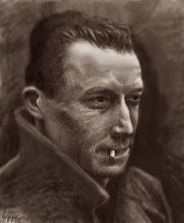
Camus Drawing/Photoshop retouch

Albert Camus. 2005 (touched up 2009). Graphite on paper with Digital Touchup. 7"x8.5"
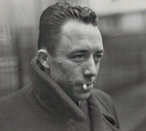
One of my wife's favorite writers is existential philosopher Albert Camus. I drew the cover of her copy of Notebooks and touched it up in Photoshop. Normally I just draw and scan, but lately I like to add some selective gaussian blurring, and for this I also copied/pasted/rubberstamped certain areas to get his overall proportions a bit closer to the cover of the book (like pushing the volume of his hair more and matching the tones of his face better). Here's the original picture so you can judge for yourself:

Subscribe to:
Posts (Atom)

